
Alright, let’s dive into something I find absolutely fascinating: the psychology of color in interior design. I mean, seriously, think about it. Color isn’t just about making a room look nice, is it? It’s about *feeling* a certain way when you walk into that room. It’s about setting a mood, sparking creativity, or even just finding a little bit of peace after a crazy day.
Color’s a big deal, trust me. I’ve spent years studying and implementing design, and I can tell you, the right color palette can transform a space—and the people in it!
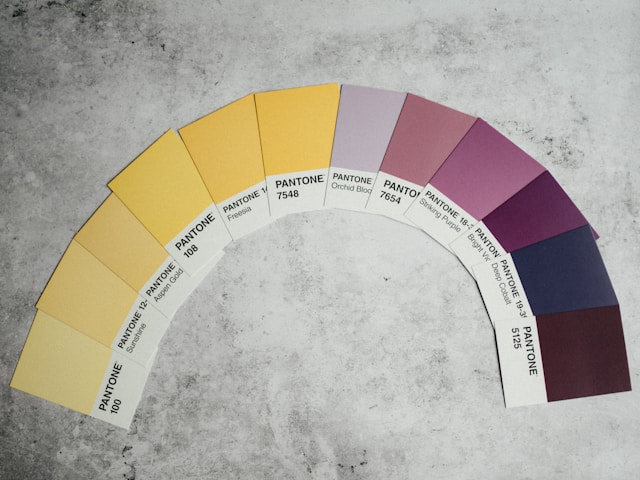
Understanding Color Theory: The Basics
Now, before we start slinging paint around, let’s touch on some basics. Remember learning about the color wheel in school? Well, it’s actually super useful here. We’ve got our primary colors (red, blue, yellow), secondary colors (green, orange, purple), and tertiary colors (like blue-green or red-violet). And they all play together… well, sometimes nicely! Understanding these relationships is key to creating a harmonious space. For example, complementary colors (opposite each other on the wheel) create contrast and excitement, while analogous colors (next to each other) create a sense of calm and unity.
Common Color Palettes and Their Emotional Impact
Okay, let’s get down to brass tacks. What do different colors actually *do* to us? This is where it gets really interesting!
- Blues: Think tranquility, peace, and serenity. Blue is fantastic for bedrooms and bathrooms—spaces where you want to unwind. Just be careful not to go *too* cool, or you might end up feeling a bit… well, blue!
- Greens: Nature, growth, and balance. Green is incredibly versatile and works well in almost any room. It can be refreshing and calming, especially when paired with natural elements.
- Yellows: Sunshine, optimism, and energy! Yellow is great for kitchens, dining rooms, and anywhere you want to boost your mood. But a little goes a long way! Too much yellow can be overwhelming.
- Reds: Passion, excitement, and energy! Red is a bold choice, perfect for making a statement. It’s great for living rooms and dining rooms where you want to stimulate conversation. Just be mindful of using it sparingly, as it can be quite intense.
- Oranges: Warmth, enthusiasm, and creativity! Orange is a fun and inviting color that works well in creative spaces and social areas.
- Purples: Luxury, creativity, and mystery! Purple can add a touch of elegance and sophistication to any room. Lighter shades like lavender are calming, while darker shades like eggplant are more dramatic.
- Neutrals (Whites, Grays, Beiges): These are your grounding colors. They provide a backdrop for your bolder choices and create a sense of calm and balance. Don’t underestimate the power of a good neutral!
Tips for Creating a Harmonious and Balanced Environment
Alright, so you know the colors, you know the theories… now what? Here are a few tips to help you create a space that truly resonates:
- Consider the Room’s Purpose: What do you *want* to do in this space? Relax? Work? Entertain? Let the room’s function guide your color choices.
- Think About Natural Light: Natural light can drastically change how a color appears. Test paint samples in your room at different times of the day to see how the light affects them.
- Start Small: Don’t feel like you have to overhaul your entire house at once. Start with a small area, like an accent wall, and see how you feel.
- Don’t Be Afraid to Experiment: Design is personal! Don’t be afraid to break the rules and try something new. It’s *your* space, after all.
- Trust Your Gut: Ultimately, the best colors for your home are the ones that you love! If a color makes you happy, go for it.
Blending Vintage with Color Psychology
Here’s where my personal passion comes in! I adore mixing vintage finds with modern design principles, and color is a HUGE part of that. Imagine a calming blue bedroom with a pop of vibrant yellow from a vintage bedside table. Or a living room with neutral walls and a bold, red vintage rug. It’s all about creating a balance and a story, right?
Take the Crate on Skates toybox, for example. It’s playful and functional, but painting it a specific color can make it even more effective. A bright yellow Crate can energize a playroom, while a soft green one can create a calming corner for reading.
Final Thoughts: Color is Personal
Okay, folks, that’s the long and short of it. Color is a powerful tool, but it’s also incredibly personal. What works for one person might not work for another. So, experiment, have fun, and create a space that truly reflects who you are! And remember, it’s okay to change your mind – paint is just paint, after all!